Mobile First: Designing Digital Displays for Thumbs, Not Desktops
In the age of smartphones and tablets, it’s easy to forget that not everyone experiences your digital display from the comfort of a desktop chair. Mobile-first design flips the script, prioritizing the smallest screen experience to ensure a seamless journey for all users. But what are the key principles to keep in mind when designing for thumbs, not mouse clicks?

CONTENT STILL REIGNS
- Prioritize and simplify: Focus on the critical information and functions, eliminating clutter and trimming text for easy thumb-scrolling.
- Scannable bites: Chunk content into digestible blocks with bold headlines, bullet points, and clear visuals.
- Readability reigns: Optimize font size and spacing for mobile screens, ensuring readable text even on the go.
THUMB-FRIENDLY NAVIGATION:
- Large, spaced tap targets: Buttons, icons, and links should be generously sized and spaced apart to avoid accidental misclicks.
- Intuitive gestures: Leverage familiar taps, swipes, and pinches for intuitive navigation and interaction.
- Minimal levels: Aim for a shallow navigation structure with easy access to key functions.
EMBRACE RESPONSIVE DESIGN:
- Fluid layouts: Use fluid grids and flexible elements that adapt seamlessly to different screen sizes and orientations.
- Progressive enhancement: Build a solid mobile foundation, then progressively add features and complexity for larger screens.
- Test, test, test: Ensure your design translates across various devices and browsers with thorough testing.
Over 60% of all web traffic
now comes from mobile devices, and that number is only growing (Statista, 2023). Think about it – that’s more than half of your potential audience scrolling past your brand on their smartphones!
OPTIMIZE FOR PERFORMANCE:
- Speed is key: Prioritize fast loading times with optimized images, efficient code, and minimal animations.
- Data savvy: Design for varying data connections, offering lightweight alternatives for users on the go.
- Offline first: Consider offline accessibility for situations with limited or no internet connectivity.
TOUCH-CENTRIC INTERACTIONS:
- Bigger isn’t always better: Avoid overly complex interactions like hover menus and opt for tap-and-hold or swipe alternatives.
- Visual feedback: Design clear visual cues for successful or unsuccessful interactions like button animations and loading indicators.
- Accessibility in mind: Consider users with disabilities by ensuring touch targets are compatible with assistive technologies.
Mobile-first design isn’t just a trend, it’s a necessary principle in today’s digital landscape. By prioritizing thumb-friendly experiences, clear content, and efficient performance, you’ll create a seamless and engaging journey for users on any device, ensuring your digital display stands out, no matter the screen size.
Ready to embrace the mobile revolution? Start designing for thumbs today!
Learn more about how we can help you adapt to the evolving marketing landscape and ramp up your efforts.
Share This Story
January 26, 2026

Last week, McDonald’s surprised people by announcing the return of Changeables—those late-’80s and early-’90s Happy Meal toys that transformed menu items into characters. For a lot of people, it was pure nostalgia. For marketers, it was a signal. What caught my attention wasn’t just the toys. It was the language. McDonald’s teased the return with a line about something coming “from [...]
January 21, 2026
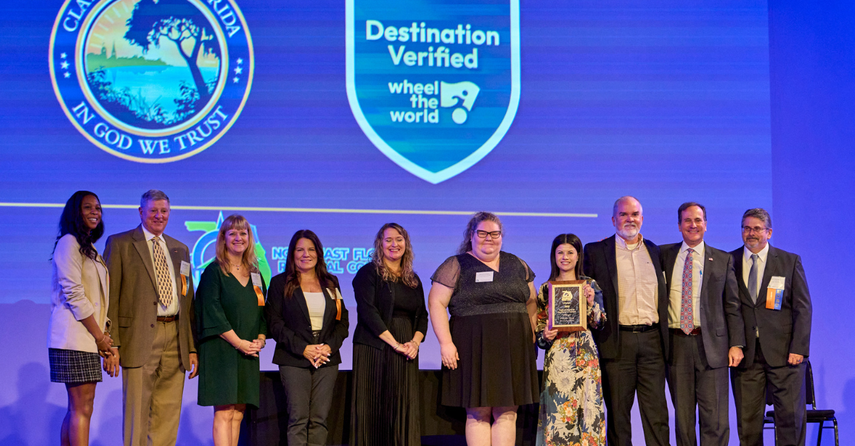
We’re proud to celebrate Clay County Tourism for earning “Destination Verified” status from Wheel the World - a meaningful recognition of their commitment to creating welcoming, inclusive travel experiences.
January 21, 2026

We’re excited to welcome Paula Vann to Advance Travel & Tourism as a Senior Account Executive. With more than a decade of experience across destination leadership and visitor intelligence, Paula brings a strong understanding of how tourism supports both travelers and the communities they visit.
 Ad Choices