The Aesthetic That Belonged: How Zohran Mamdani’s Campaign Became a Cultural Case Study
The Aesthetic That Belonged
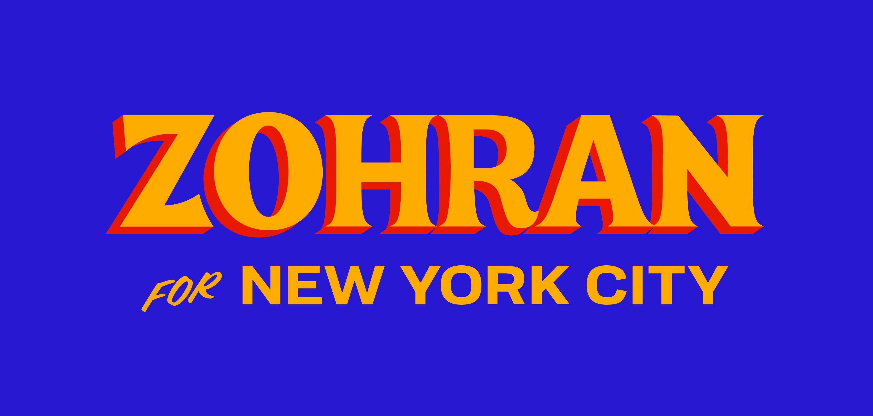
In an election season saturated with polished slogans and traditional campaign signage, Zohran Mamdani’s campaign stood out, not because of his policy framing or debate performance, but through how it looked and felt. The aesthetics behind his run reframed what political branding can be and how we can all think about our customers.
A Palette That Shouted “This is New York”
Instead of traditional red-white-blue color schemes, his campaign adopted cobalt blue and marigold yellow, vivid, high-contrast, unmistakable. Designer Ameesh Bhoopaty and Phil Ditzler at the Philadelphia-based co-op Forge created the campaign’s visual identity, anchored in a hand-drawn aesthetic. Zohran Mamdani’s campaign stood out with color combinations influenced by street-level signage in bodegas, halal carts and taxi-cabs. The effect? At a glance, posters and window-stickers didn’t just signify a candidate, they invoked a lived experience of the city.
Typography With Attitude
The campaign’s fonts leaned into vintage comic-book and hand-painted signage aesthetics rather than the ultra-clean sans-serif approach typical of political campaigns. The stylized lettering featured shadows, tilts and an energy that said “young, urban, engaged.” This unconventional approach created strong memorability and visual distinction in a crowded field of sameness.
Grounded in the City’s Culture
One of the most interesting features of this aesthetic strategy: it didn’t adopt polished corporate branding. Instead, it leaned into the foothold of everyday New York texture, bodegas with flickering strip-lights, hand-painted alley signs, bricks and graffiti, taxis and food carts. By anchoring the look in place and experience rather than generic “politics,” the campaign tapped a visceral sense of belonging.
Breaking Design Rules to Get Closer to Place
This campaign offers a masterclass in place-based branding that travel marketers can learn from. The key insight? Sometimes the path to authentic connection requires breaking conventional design rules.
Traditional marketing wisdom tells us to use clean sans-serif fonts, maintain high contrast for readability, and stick to professional color palettes. But Mamdani’s team understood something crucial: New York doesn’t look like a corporate style guide. The city’s visual language is chaotic, hand-painted, and gloriously imperfect. By mirroring that aesthetic rather than fighting it, the campaign created instant recognition and belonging.
For travel marketers, this translates to a powerful question: Does your destination’s visual identity reflect what the place actually looks, sounds, and feels like, or does it look like every other travel brand?
Consider the difference between a destination campaign that uses stock photography of sunsets and pristine beaches versus one that captures the worn tiles of a beloved local café, the hand-lettered signs in a neighborhood market, or the specific shade of blue that every taxi happens to be painted. The latter might not win design awards for polish, but it will resonate far more deeply with people who know the place and intrigue those who want to.
The Permission to Be Imperfect:
Understanding your place deeply gives you permission to abandon generic “best practices” in favor of authentic representation. A campaign for Tokyo might embrace maximalist neon chaos. One for a rural Scottish island might use hand-drawn maps and weathered textures. A Caribbean destination could lean into vibrant, clashing colors that mirror painted buildings and carnival costumes.
This isn’t about being deliberately rough or unpolished for its own sake, it’s about visual honesty. When your design choices are rooted in genuine observation of place, even unconventional aesthetics feel right rather than random.
Moving People Through Recognition:
The reason this matters for moving audiences is simple: recognition triggers emotion faster than information. When someone from New York saw those bodega-inspired colors and hand-painted typography, they didn’t just think “that’s nice design”—they felt seen. They recognized their city. That emotional shortcut is what travel marketers should aspire to create.
Your audience isn’t looking for perfectly polished, they’re looking for real. When you truly understand the texture of your place, you earn the right to break design rules in service of that truth. And that’s often what transforms a viewer into a visitor.
Learn more about how we can help you adapt to the evolving marketing landscape and ramp up your efforts.
Share This Story
November 12, 2025
The Aesthetic That Belonged In an election season saturated with polished slogans and traditional campaign signage, Zohran Mamdani's campaign stood out, not because of his policy framing or debate performance, but through how it looked and felt. The aesthetics behind his run reframed what political branding can be and how we can all think about our customers. A Palette That [...]
November 11, 2025
The most critical question for every travel marketer is often the hardest: How should you split your budget between awareness and conversion? There's no magic number—the answer must be driven by your destination's unique strengths and goals.
November 7, 2025

Today’s travelers don’t just want to be inspired—they expect every interaction to feel personal. In 2025, hyper-personalization is redefining how destinations attract, engage, and convert visitors.